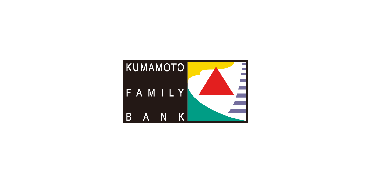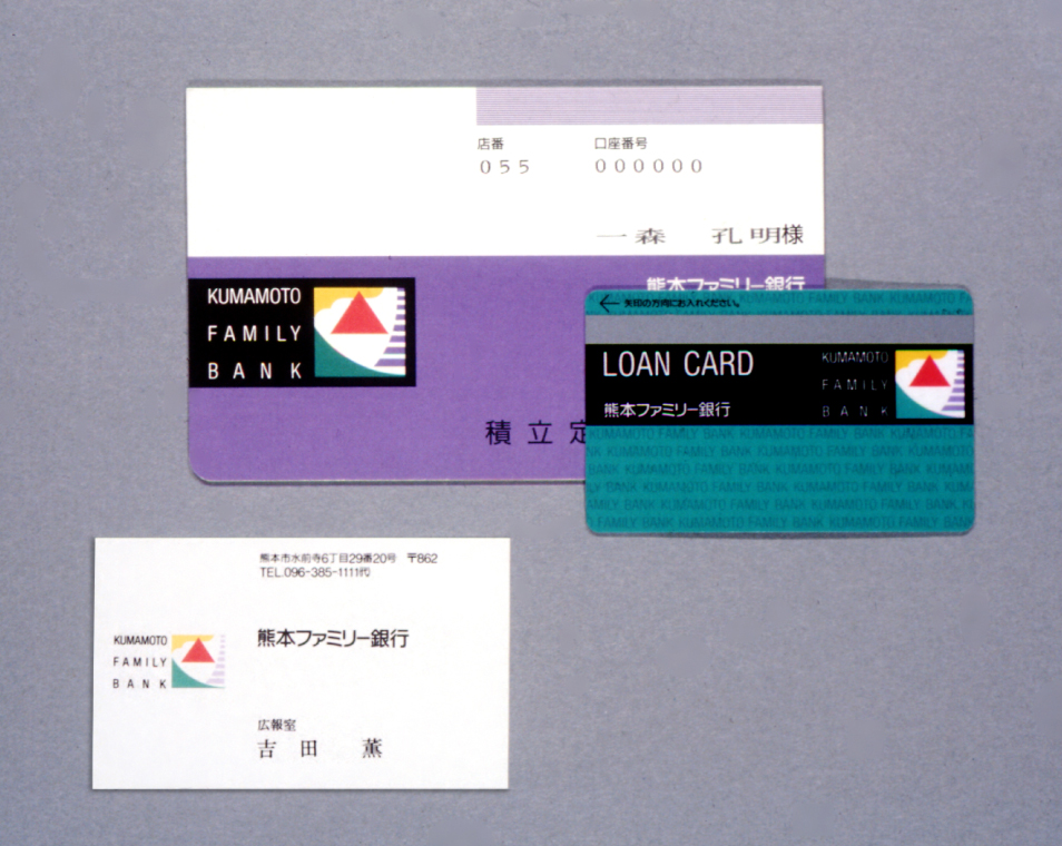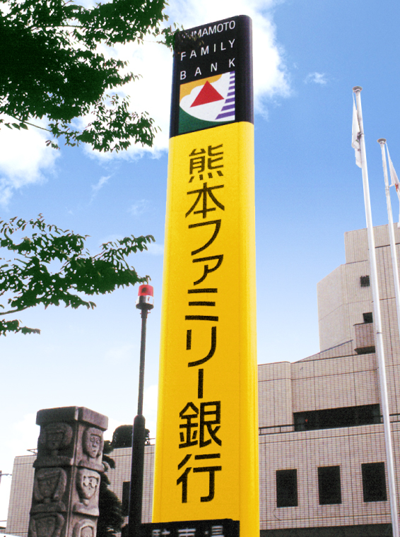


熊本ファミリー銀行(現在は熊本銀行に社名変更されました)熊本銀行と肥後ファミリー銀行の合併により生まれました。 「人間性」「創造性」「能動性」の3つのバランスを象徴する三角形を中心に、熊本の自然や文化遺産も表すカラフルなデザインでした。
Kumamoto Bank and Higo Family Bank, both operating mainly in Kumamoto Prefecture and with close connections with the community, have merged and transformed into a regional bank that engenders high expectations among the local citizens. It is indeed a retail bank of Kumamoto, by Kumamoto, for Kumamoto. The triangle at the center of the symbol shows a balance among “humanity,” “creativity,” and “activity,” the three ideas that make up the foundation of the bank’s corporate concept. Mother Nature and the cultural heritage of Kumamoto Prefecture are some other elements that are also included in the symbol. The new bank provides a colorful symphony that resonates throughout Kumamoto.
以熊本范围为中心的地域密集型熊本银行和肥后家族银行凭借合并,脱胎换骨成为承担着本地期待的地方银行。名副其实的“熊本的,来自熊本的,为了熊本的”零售银行。