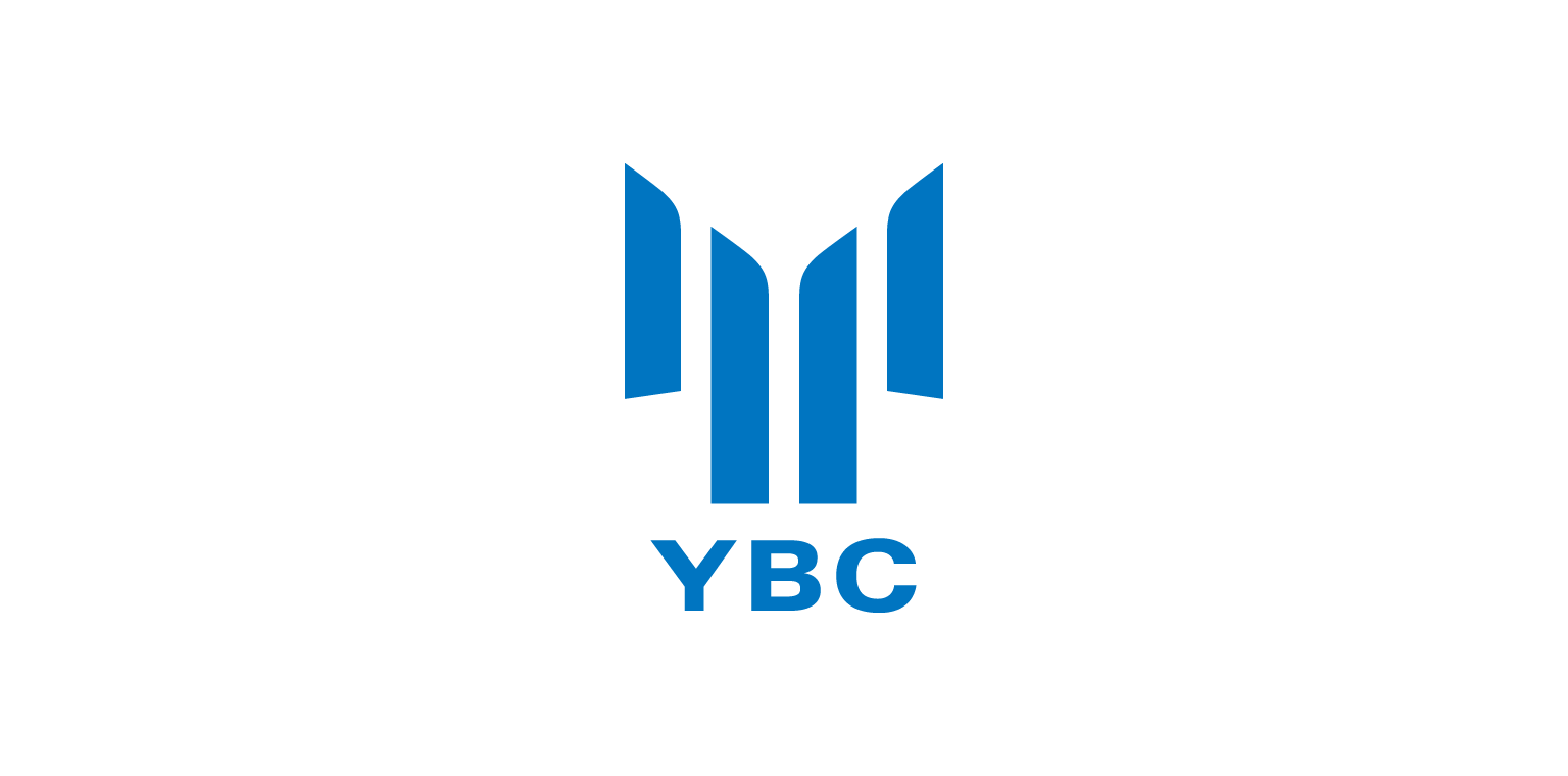
橋梁設計と建築ではトップクラスの横川橋梁の、社名変更にともなう新しいアイデンティティのデザイン。設計の「支え」と「吊り」を視覚化した "Y" のロゴはコーポレートカラーのブルーとともに技術イメージを的確に伝えます。
To keep in step with the times, this top-level bridge design and construction company has changed its name from Yokogawa Kyo-ryo to Yokogawa Bridge. The logo based on the letter Y expresses the image of “support” and “suspension” for a bridge, emphasizing the concept of engineering.
在桥梁设计和建筑界处于顶尖级别的横河桥梁顺应时代进行了公司名变更。以桥设计的“支撑”和“悬吊”为构想的Y字母是技术形象高超的设计。
Copyright © 2014 The Design Associates Co.,Ltd. All Rights Reserved.